Now that we are able to classify the category of an individual piece of clothing using our model, we will visualize these predictions by creating a bar plot for a specified image.
Predicated Classification
The plot_image function displays an image along with its predicted classification, the confidence level of the model for that category, and the actual classification (which is for reference).
A confidence level is used to convey how confident or certain we are in our answer being correct. If you have to predict whether it will rain tomorrow, your possible answers are yes or no. What if you’re not totally certain in your answer, though? If the weather reporter predicted rain for tomorrow, you may say you are 90% confident. This means that you are pretty sure it will rain tomorrow, but it also tells us that you think there is a 10% chance you may be wrong.
A smaller confidence level indicates you are less certain in your answer being correct, that you are likely to be wrong or incorrect in some capacity. The closer to 100 our confidence level is, the more certain we are in our prediction.
Copy the plot_image function into your Google Colab Notebook:
def plot_image(i, predictions_array, true_label, img):
  true_label, img = true_label[i], img[i]
  plt.grid(False)
  plt.xticks([])
  plt.yticks([])

  plt.imshow(img, cmap=plt.cm.binary)

  predicted_label = np.argmax(predictions_array)
  if predicted_label == true_label:
    color = 'blue'
  else:
    color = 'red'

  plt.xlabel("{} {:2.0f}% ({})".format(class_names[predicted_label],
                                100*np.max(predictions_array),
                                class_names[true_label]),
                                color=color)
Visualizing Confidence Values
The plot_value_array function plots the confidence values generated by the model as a bar graph.
The y-axis of the graph will display the confidence level, while the x-axis of the graph will represent the categorization of items (t-shirt/top, trouser, pullover, dress, coat, sandal, shirt, sneaker, bag, or ankle boot).
Copy the plot_value_array function into your Google Colab Notebook:
def plot_value_array(i, predictions_array, true_label):
  true_label = true_label[i]
  plt.grid(False)
  plt.xticks(range(10))
  plt.yticks([])
  thisplot = plt.bar(range(10), predictions_array, color="#777777")
  plt.ylim([0, 1])
  predicted_label = np.argmax(predictions_array)

  thisplot[predicted_label].set_color('red')
  thisplot[true_label].set_color('blue')
Using the Functions
We will use the following code to call on the functions we wrote previously. Copy the snippet into your Google Colab Notebook.
i = 0
plt.figure(figsize=(6,3))
plt.subplot(1,2,1)
plot_image(i, predictions[i], test_labels, test_images)
plt.subplot(1,2,2)
plot_value_array(i, predictions[i],  test_labels)
plt.show()

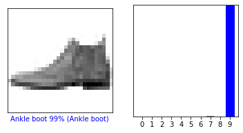
We can see that our model predicts this item to be an ankle boot. How confident is the model in this prediction? 99% confident. The category in paranthesis is the correct categorization of the item. In this case, the model detected the item correctly.Keep in mind that not all models are perfect. Models can get their predictions wrong as we will see in the next example.
We will use the same code as before, but test the confidence with a different item. Set i equal to a new value, like 12.
i = 12
plt.figure(figsize=(6,3))
plt.subplot(1,2,1)
plot_image(i, predictions[i], test_labels, test_images)
plt.subplot(1,2,2)
plot_value_array(i, predictions[i],  test_labels)
plt.show()

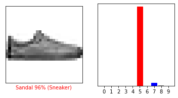
From this example we see that the model predicted the item to be a sandal with 96% confidence. However, we see that the correct identification of the item is a sneaker. The plot shows that the model also predicted this item to be a sneaker with ~ 3% confidence or an ankle boot with ~ 1% confidence.
More Examples
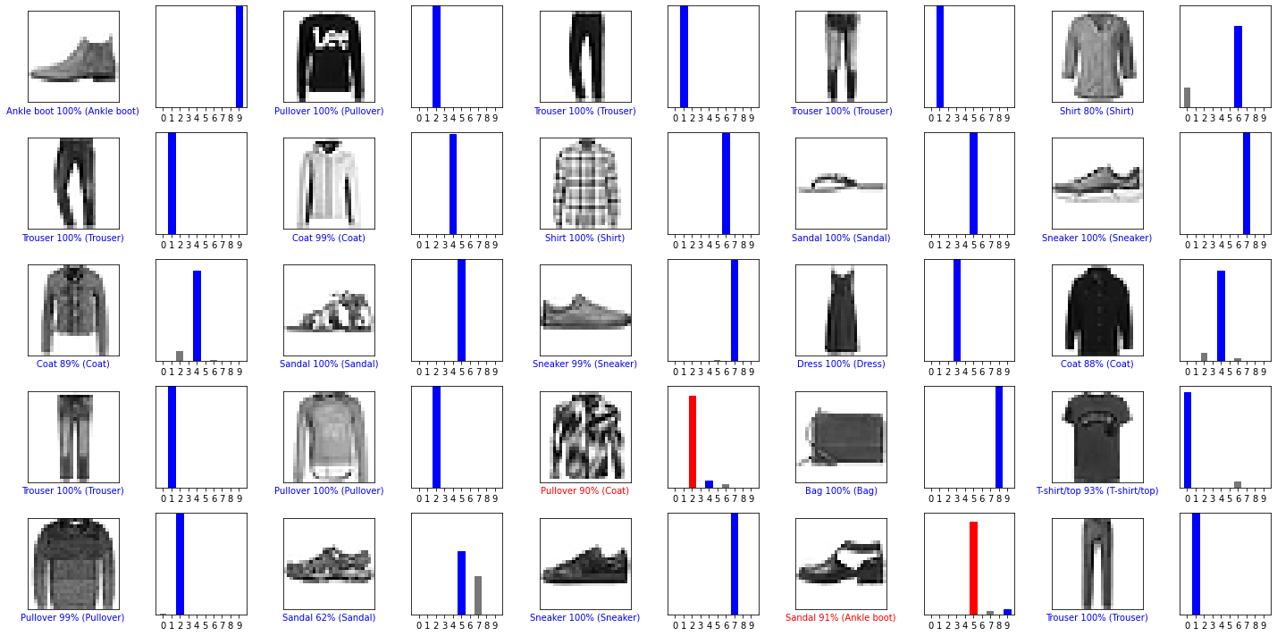
For more examples of the model predictions, plot the first 25 test images, their predicted labels, and the true labels. As before, the correct predictions will be shown in blue and the incorrect predictions in red.
Copy this code into your Google Colab Notebook:
num_rows = 5
num_cols = 5
num_images = num_rows*num_cols
plt.figure(figsize=(2*2*num_cols, 2*num_rows))
for i in range(num_images):
  plt.subplot(num_rows, 2*num_cols, 2*i+1)
  plot_image(i, predictions[i], test_labels, test_images)
  plt.subplot(num_rows, 2*num_cols, 2*i+2)
  plot_value_array(i, predictions[i], test_labels)
plt.tight_layout()
plt.show()

What do you think about the model’s predictions? Would you be satisfied with this success rate?
