Workshop Resources
Plotting an Image’s Category
You may remember that, when we were plotting the models, the x-axis of the graphs was labeled with the numbers 1 through 9. These correspond to the categories of items that we defined earlier in the workshop, i.e. t-shirt/top, trouser, pullover, dress, coat, sandal, shirt, sneaker, bag, and ankle boot.
img = test_images[0] # Grab an image from the test dataset.
# NOTE: This index will be changed and its corresponding plot will be displayed in the next few steps

print(img.shape) # This shows the resolution of the image.
img = (np.expand_dims(img,0)) # This expands the img array

print(img.shape)
# This gives the confidence level that the image corresponds with each category.
# For example, the probability that the image is a T-shirt is 5.2198538e-07.
predictions_single = probability_model.predict(img)

print(predictions_single)
plot_value_array(0, predictions_single[0], test_labels)

# Plot the graph and label the x-axis with the class_names
# or otherwise known as the categories we made in Activity 1
_ = plt.xticks(range(10), class_names, rotation=45)
To verify the index value with the highest probability, we use the following code.
# The output of this tells us what category the clothing item had the
# highest probability of being a part of
np.argmax(predictions_single[0])
Experimenting with Plots
In the first code segment of this activity, change the index value for the test_images array to any number of your choice.
Question 1
In the plot_value_array, change the first parameter to the same index number used previously. What class name has the highest probability?
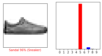
Verify your answer by running the code below to display the specified image and the plot of the category that the model predicted.
Is this consistent with the answer from your previous question?
i = your_desired_value   # We can see that this image detects the right class name for the image
plt.figure(figsize=(6,3))
plt.subplot(1,2,1)
plot_image(i, predictions[i], test_labels, test_images)
plt.subplot(1,2,2)
plot_value_array(i, predictions[i],  test_labels)
plt.show()
